I like this one, as it shows the depth and height of the tree from underneath the flower, the idea of this was to show the focused flower and the blurred background like her image below, but i adapted her idea and changed it according to my image; for example this one has obviously got the focused section along the bottom and has a smaller proportion of the blurred background. 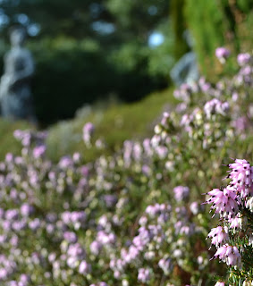

This one is slightly different, although the whole image is mainly unfocused, there is still the corner of focused detail which she used in her image. The only main difference is that the focused section is in a different corner and the image as a whole tells a different story.
This pink petal image is near enough identical to her own image, but has a slightly smaller focused corner and is much more zoomed in so there is more blur to the image.
All these three images above are inspired from this image of Uta's below:
This was because I really liked the idea of having mainly the whole image unfocused and blurred with a small corner of focused and detailed imagery. So I used this idea and developed it according to my own photos.
I liked the idea of showing the whole image; then selecting different angles or close ups of the same image. So that is what I did for my image above.
Lastly, this image was inspired by:

I really liked this idea of using the same image but just manipulating it each time, I like the change in patterns and colours from both mine and Uta's image.
While creating my own images inspired by Uta's I print screened to show my process when using Photo shop:
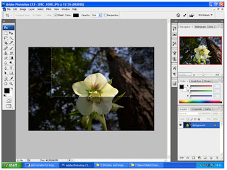 Here I had selected the area I had chosen to crop.
 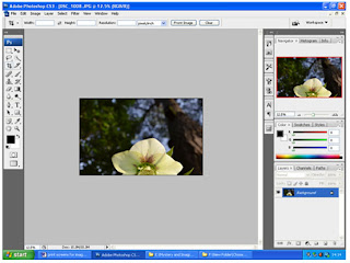 This shows my final image once cropped.
 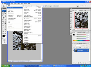 Once my image was inserted into photo shop, I started to select which manipulation I was to use (Hue & saturation, Shadows/highlights, black and white etc)
 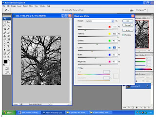 Here for my second image manipulation I chose black and white: so this simply shows my process of doing so.
 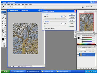 I then chose shadows and highlights for my second image manipulation.
 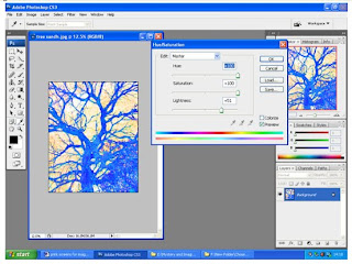 This was my last manipulated image for this certain one; I chose hue and saturation.
I chose all these different adjustments as they all brought different colours and textures to each image which is what I was expecting when putting together this specific image. Like Uta's image she has the same image repeated and manipulated differently; which is what I aimed for.
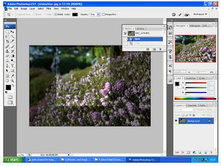 This image only has two steps: this first one was just selecting which area I was aiming to crop.
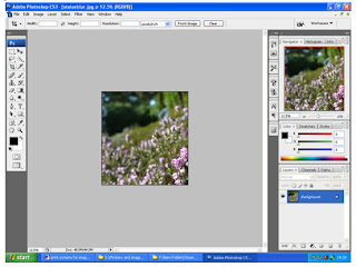
Then this was the final out come once cropped.


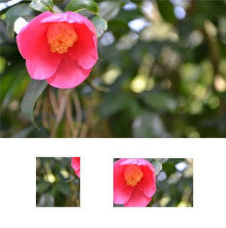 I was inspired by this image:

No comments:
Post a Comment